Theme
The theme sets the colors, fonts, corners and button styles across every page of your site. You set it once, and every block and every page follows it.
Press the palette icon on the editor's left rail to open the Theme panel. Every change shows up on the page next to it immediately.
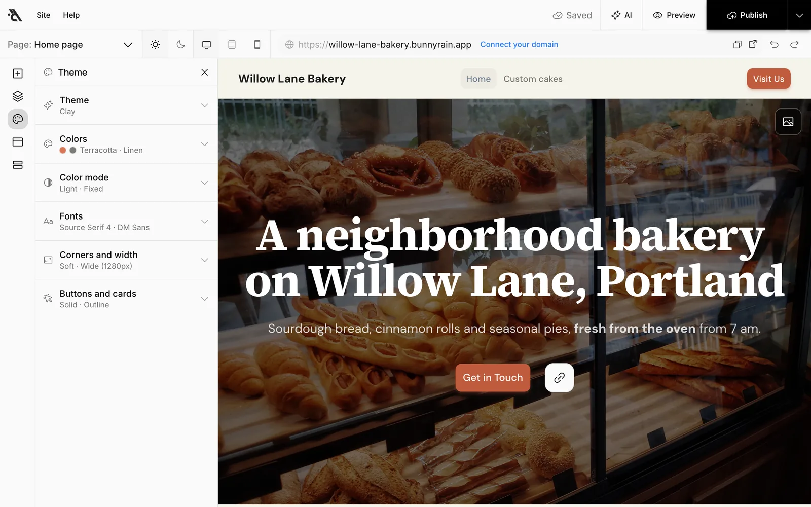
The panel has six sections. Each section's header shows its current value (for example Colors: Terracotta · Linen); press the header to open the section.
Theme
The quickest start is a ready-made theme. Press one and the colors, fonts and corners change together.
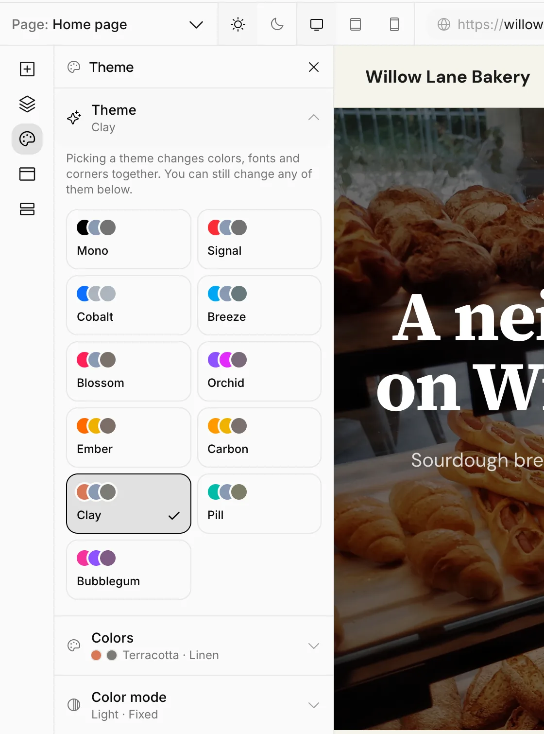
Try the themes one by one; once you find one you like, you can change any setting in the sections below. Even if you switch to another theme later, the settings you changed yourself are kept.
Colors
- Primary: Used for buttons, links and highlights. It's the color people remember your site by; pick one that goes with your logo or sign.
- Base color: The neutral color used for backgrounds and text. Warm (cream, sand) or cool (gray, slate) tones set the mood of the site.
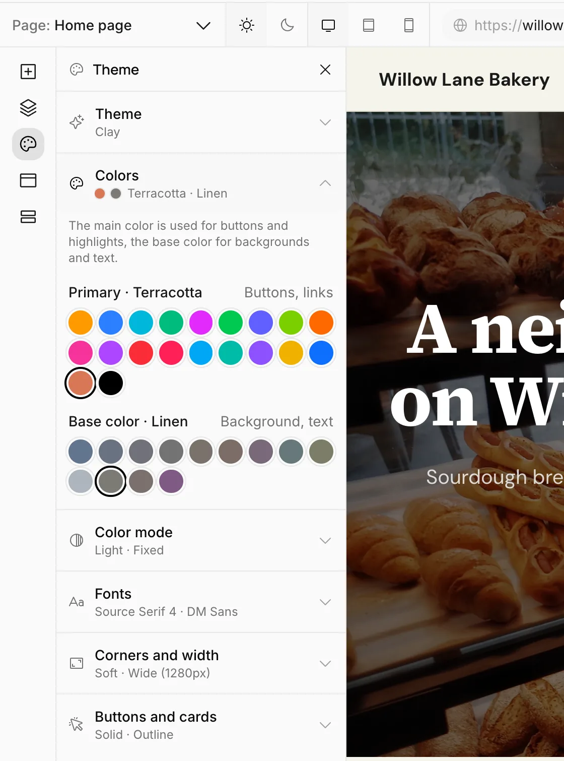
The colors you give text with the formatting toolbar come from here too; when you change the colors, that text changes with them.
Color mode
Choose whether your site looks light or dark:
- What visitors see: Light, Dark or Match device. With Match device, a visitor whose phone is in dark mode sees your site in dark.
- Let visitors switch: When on, a light / dark button is added to the header; the visitor's choice is remembered in their browser.
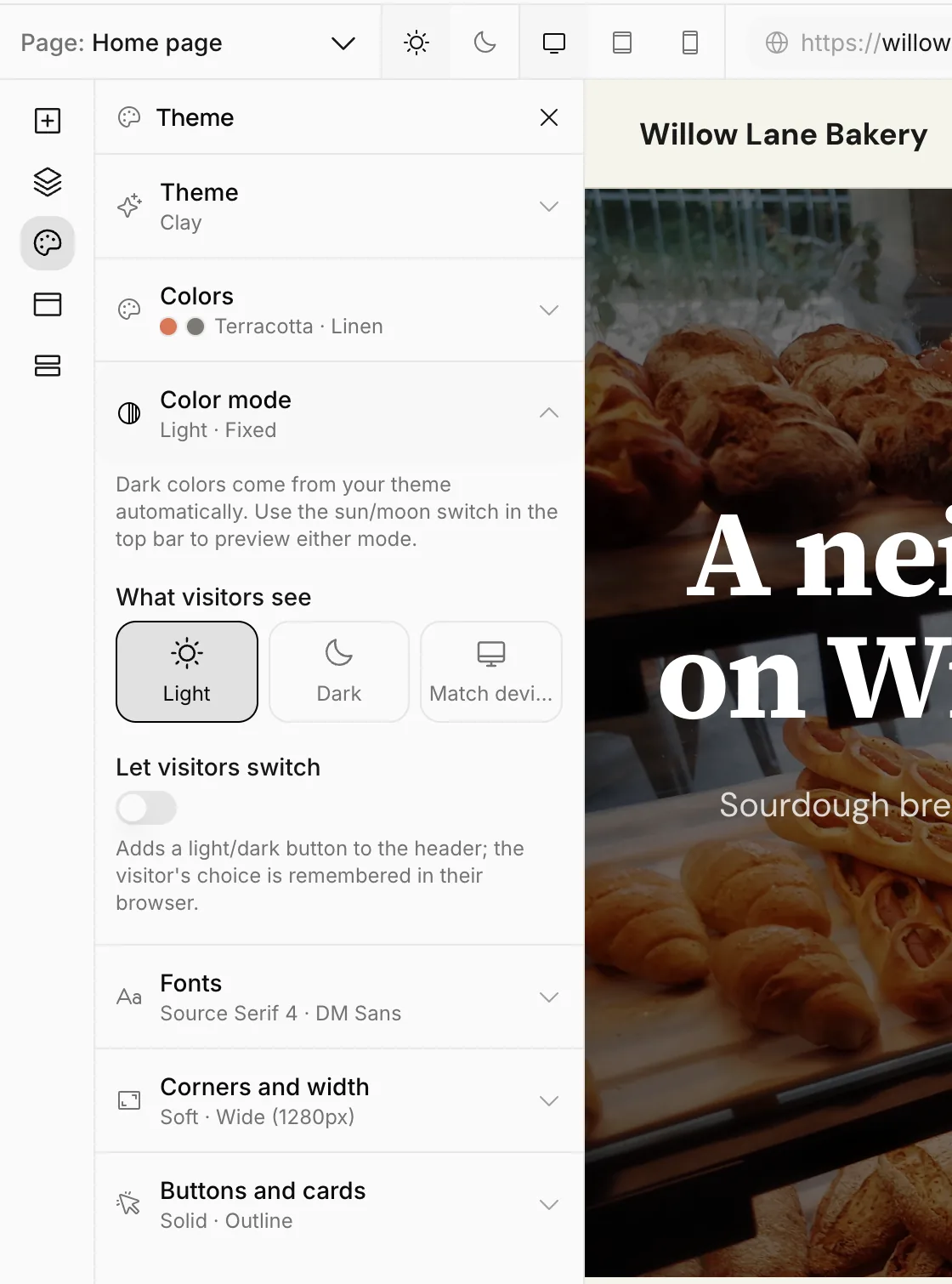
You don't pick dark colors separately; they come from your theme. Check how your site looks in dark mode with the sun / moon buttons at the top of the editor.
Fonts
You can pick separate fonts for Headings and Text. The list opens with a few hand-picked fonts; as you type in the box, it searches all Google Fonts.
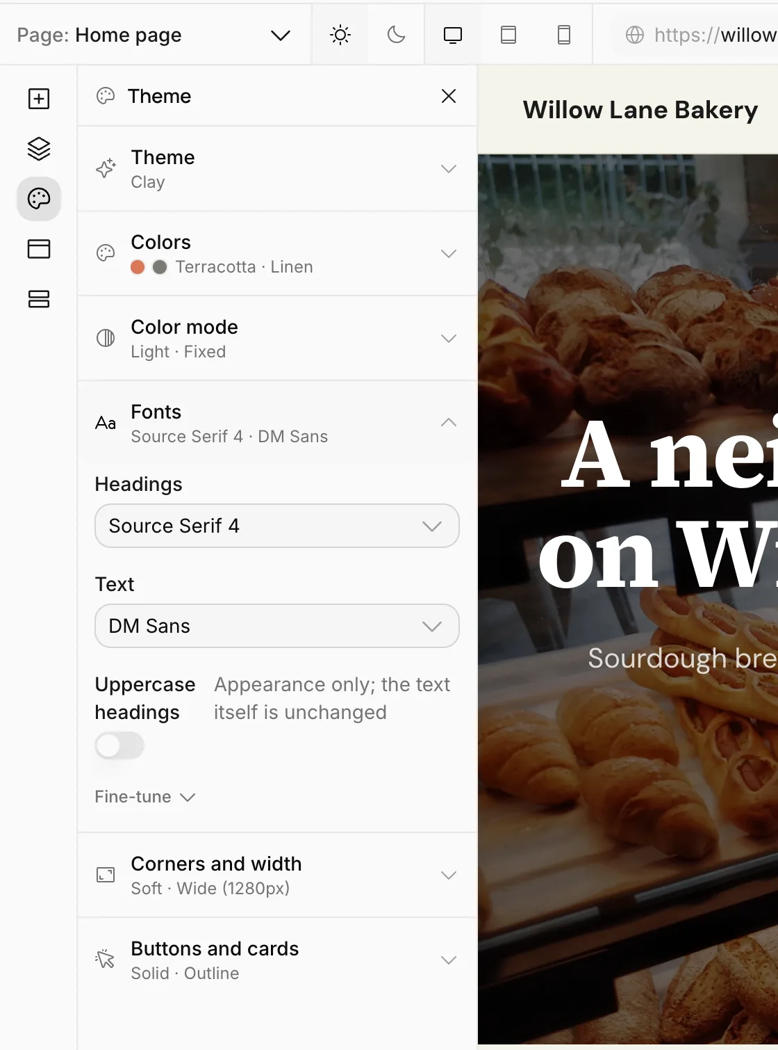
- Uppercase headings: Shows headings in capital letters. Appearance only; the text you typed doesn't change.
- Fine-tune: Details such as font weights, letter spacing and line height.
Corners and width
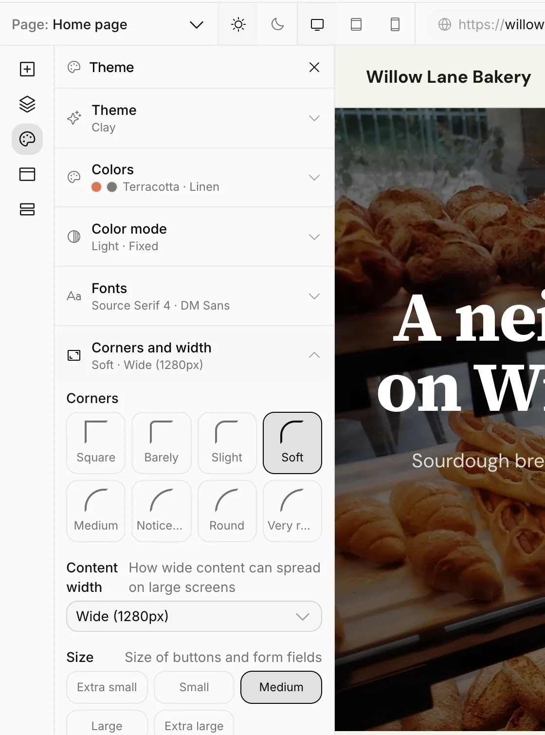
- Corners: How rounded the corners of buttons, cards and images are. Square corners look serious; rounded ones look friendly.
- Content width: How wide the content can spread on large screens.
- Size: The size of buttons and form fields.
Buttons and cards
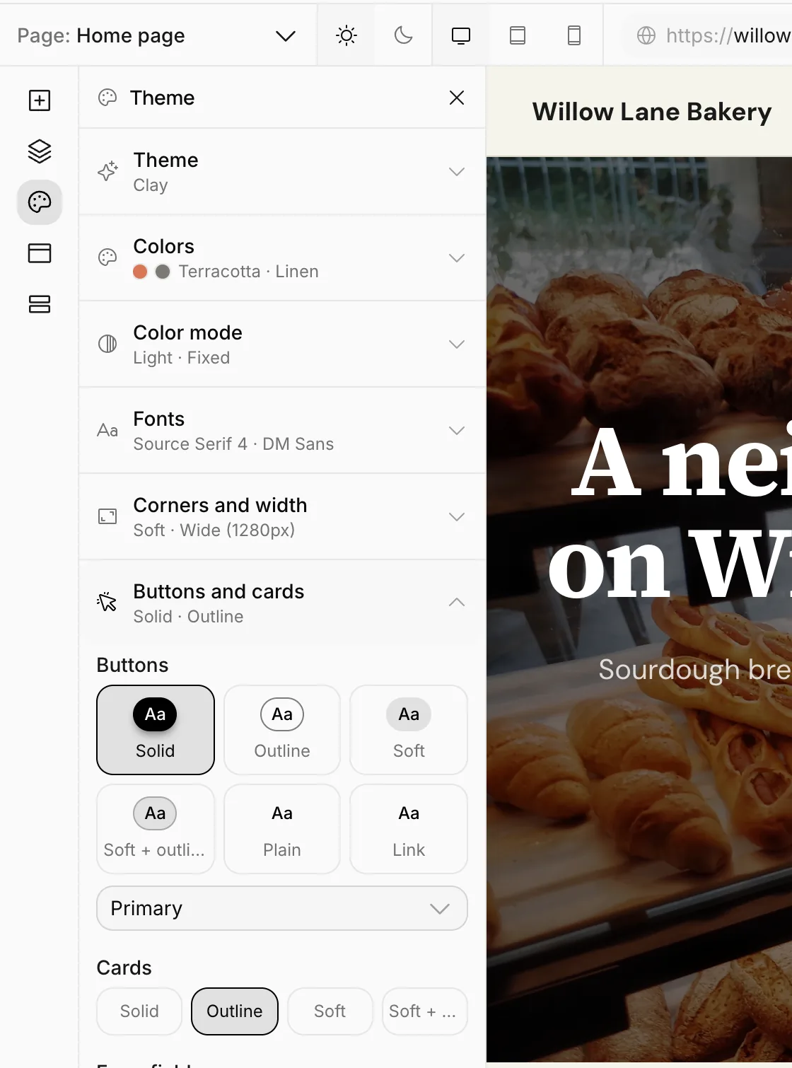
Choose the style of buttons, cards and form fields: Solid, Outline, Soft, Soft + outline, Plain or Link. Each option has a small preview.
Go back to the theme
If you changed settings away from the ready-made theme's values, the top of the panel says how many settings differ, and the changed section's header shows a dot. Press Back to theme to remove these changes and bring back the theme's own values. This can't be undone with the undo button, but it only affects the draft.
The theme changes when you publish
Theme changes go into the draft just like pages; visitors see the old theme until you press Publish. So feel free to experiment with colors.
Publish publishes the theme and all pages together. To publish only the theme, open the arrow next to Publish and press Publish on the Site appearance row. See Publishing and publish history.