Blocks and layouts
Your page is made of blocks stacked on top of each other: a hero at the top, then about, services, a gallery, a contact form and so on. Each block is a section of the page. You build your page by adding blocks, putting them in order and choosing the right layout for each one.
Which blocks are there
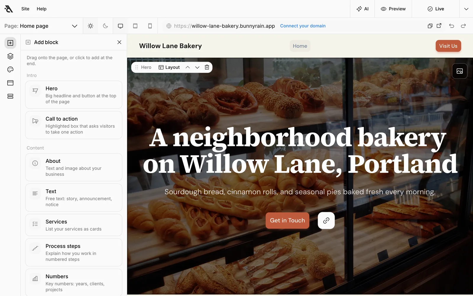
The blocks are grouped into six categories in the Add block panel:
| Category | Blocks |
|---|---|
| Intro | Hero (the big headline and button at the top of the page), Call to action (a highlighted box that asks visitors to take one action) |
| Content | About, Text (free text), Services, Process steps, Numbers, List (blog posts or a collection's pages) |
| Images & video | Gallery, Video (YouTube or Vimeo) |
| Trust | Testimonials, Google reviews, Team, Logos (brands you work with) |
| Prices | Pricing (compare 2–4 plans side by side), Price list (service or product prices) |
| Contact | Contact (form, phone, WhatsApp, map), Opening hours, Appointment, FAQ |
The header (the menu at the top of the page) and the footer aren't blocks; they look the same on every page and are edited in their own panels. See Header and footer.
Add a block
The + button on the left rail opens the Add block panel. You can add a block in two ways:
- Click it: The block is added at the end of the page.
- Drag it: Drag the block to wherever you want on the page. A line shows where it will land.
The editor scrolls to the new block and highlights it briefly.
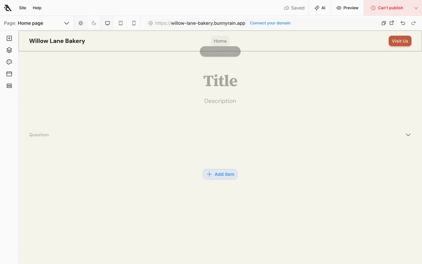
A new block arrives empty: faint placeholders tell you what goes in each field (Title, Description, Question and so on). Click a placeholder and start typing. In blocks with lists (questions, service cards, photos), press Add item to add another one.
Change the layout
Most blocks have several layouts: the same content, arranged differently. For example, the Services block can be shown as cards, an icon list, numbered rows or glowing cards on a dark background. Your text and images stay the same when the layout changes.
Hover over the block and press Layout in the bar that appears in the top left. The options are shown as small sketches; press one and the block switches to it right away. The window stays open so you can try the options one by one and compare.
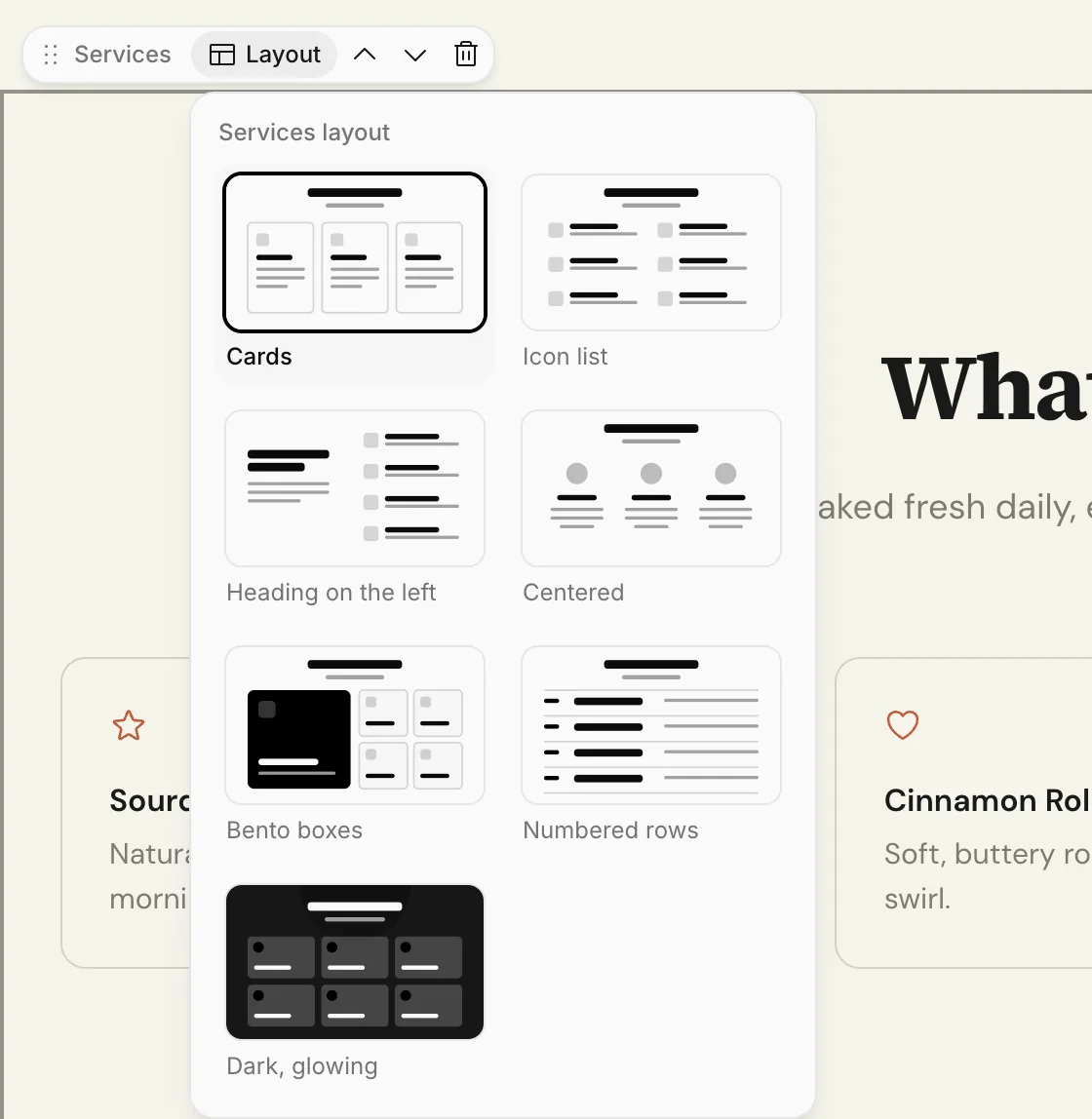
To go back from a layout you don't like, pick the first option again or undo ( Z).
The Blocks panel
The second button on the left rail opens the Blocks panel. It lists every block on the page in order, with the layout it uses under its name (Full-screen image, Cards, Grid…).
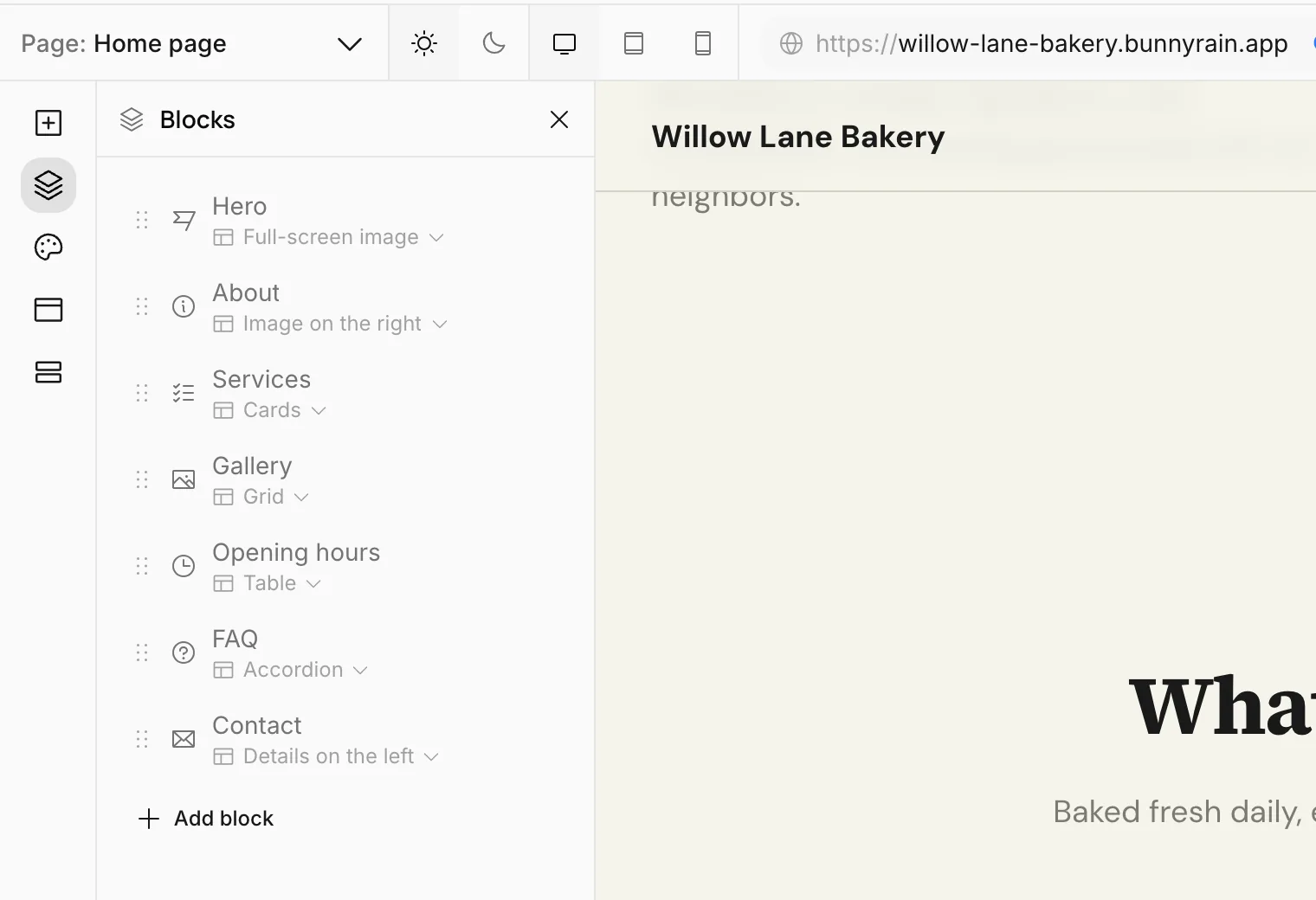
- Click a row: The page scrolls to that block. On long pages, this is the quickest way to find a section.
- Click the layout name: The layout options open under the row and change the page live.
- Drag a row: Changes the block's position.
- Hover over a row: Use the up and down arrows to move the block one step, or the trash can to delete it.
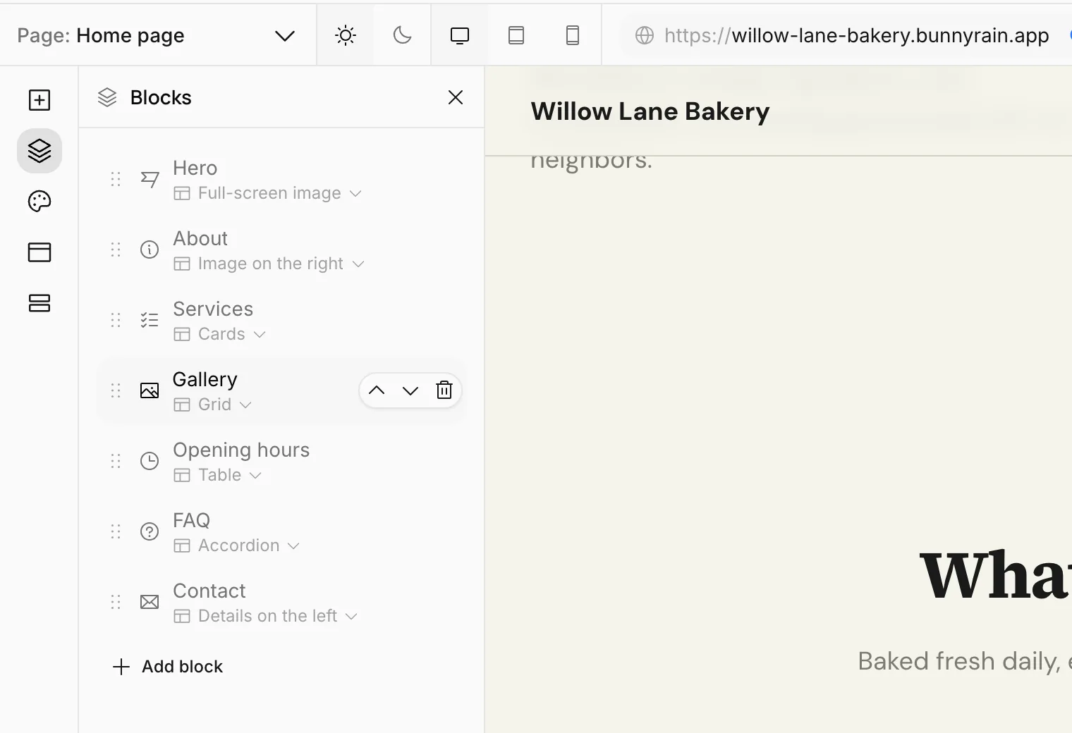
Add block at the bottom also opens the library.
Move blocks
You can also change the order on the page itself. Grab the name in the block's bar (for example Hero) and drag it, or press the up and down arrows in the bar.
Delete a block
Press the trash can in the block's bar or in the Blocks panel. When you press Delete in the confirmation window, the block and the text inside it are deleted.
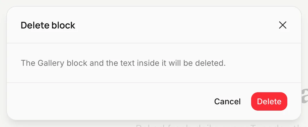
If you deleted something by mistake, undo right away ( Z). Deleting is saved to the draft like any other change; the block stays on the live site until you publish.
Block settings
Some blocks have settings beyond their text and layout. These blocks show a Settings button in their bar. For example, in the List block you choose which collection to list, how many cards to show and whether to split them into pages. See Collections.