Editing text and images
The page you see in the editor is your site itself, and you edit everything directly on it. There are no separate forms to fill in: just click the text or image you want to change.
Change text
Click a heading, a paragraph or a button label. A frame appears around the text and the cursor goes inside. Changes are saved as you type; to leave the box, click an empty spot or press Esc.
Some fields are plain text: button labels, names, job titles, phone numbers, prices. These fields have no formatting toolbar, and Enter closes the field. When you paste text copied from somewhere else, its formatting is dropped and only the text comes in.
Format text
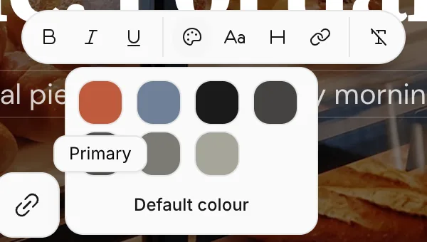
Select part of a text and a formatting toolbar opens above it.

From left to right:
- Bold, Italic, Underline
- Colour: Gives the text one of your site's theme colors (Primary, Secondary, Highlighted, Normal, Toned, Muted, Dimmed). Default colour removes it.
- Font: Switches the selected text to the theme's heading, body or monospace font. Each option shows the name of the font in your theme.
- Text size: Thirteen steps, from the smallest (
xs) to the largest (9xl). The list opens with the text's current size selected; pressing the selected size again resets it. - Link: Links the selected text to an address.
- Bullet list and Numbered list (in longer text fields)
- Clear formatting: Removes all formatting from the selected text.
Change images
Click an image. In the window that opens, you can change it in three ways:
- My library: Press Upload image and choose a photo from your computer or phone. Images you've already uploaded to this site are listed here too.
- Stock photos: Search free stock photos (see below).
- Image URL: Paste the address of an image that's hosted somewhere else.
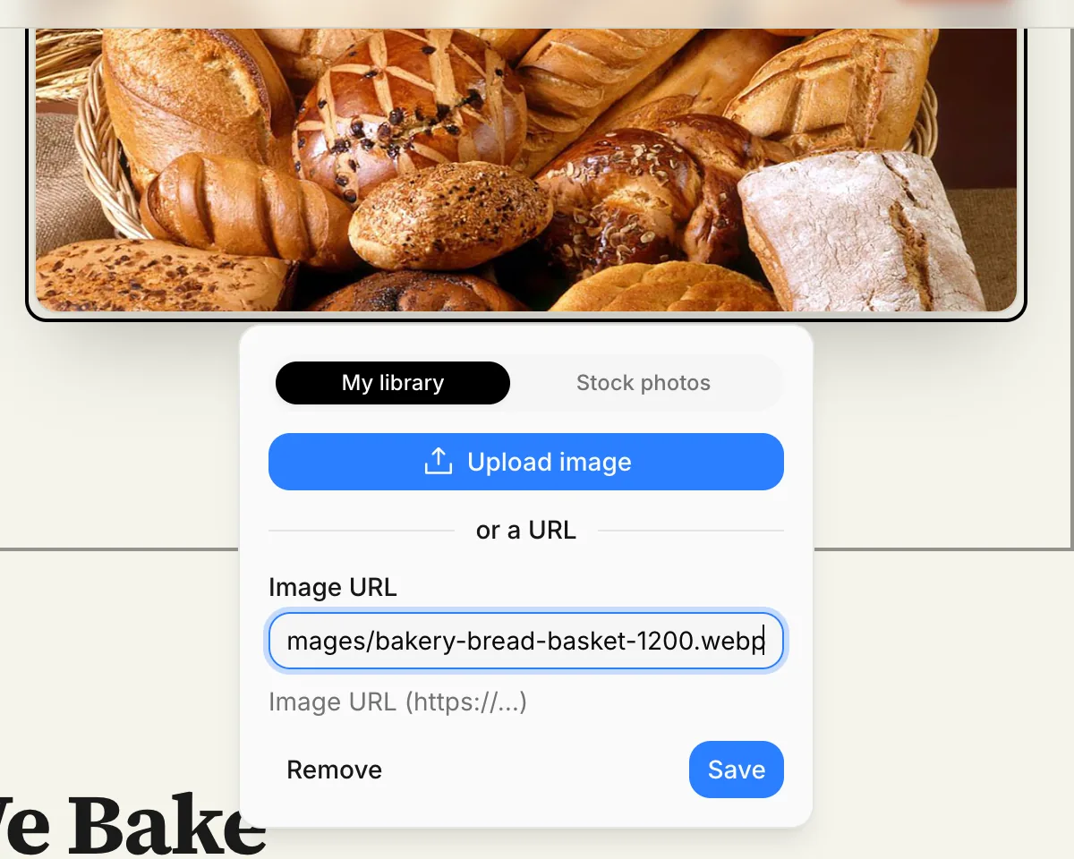
Remove takes the image out of the field; the file stays in your library. In blocks like Gallery and Logos, the same window also has an Image description: screen readers used by blind visitors and search engines read this short description.
An uploaded file can be up to 5 MB; JPEG, PNG, WebP, AVIF and GIF are accepted. Photos taken with a phone are usually under the limit.
Pick a stock photo
If you don't have a suitable photo, search on the Stock photos tab. Type a few words describing what you need (for example "sourdough bread") and press Search. Click the photo you like and it's placed.
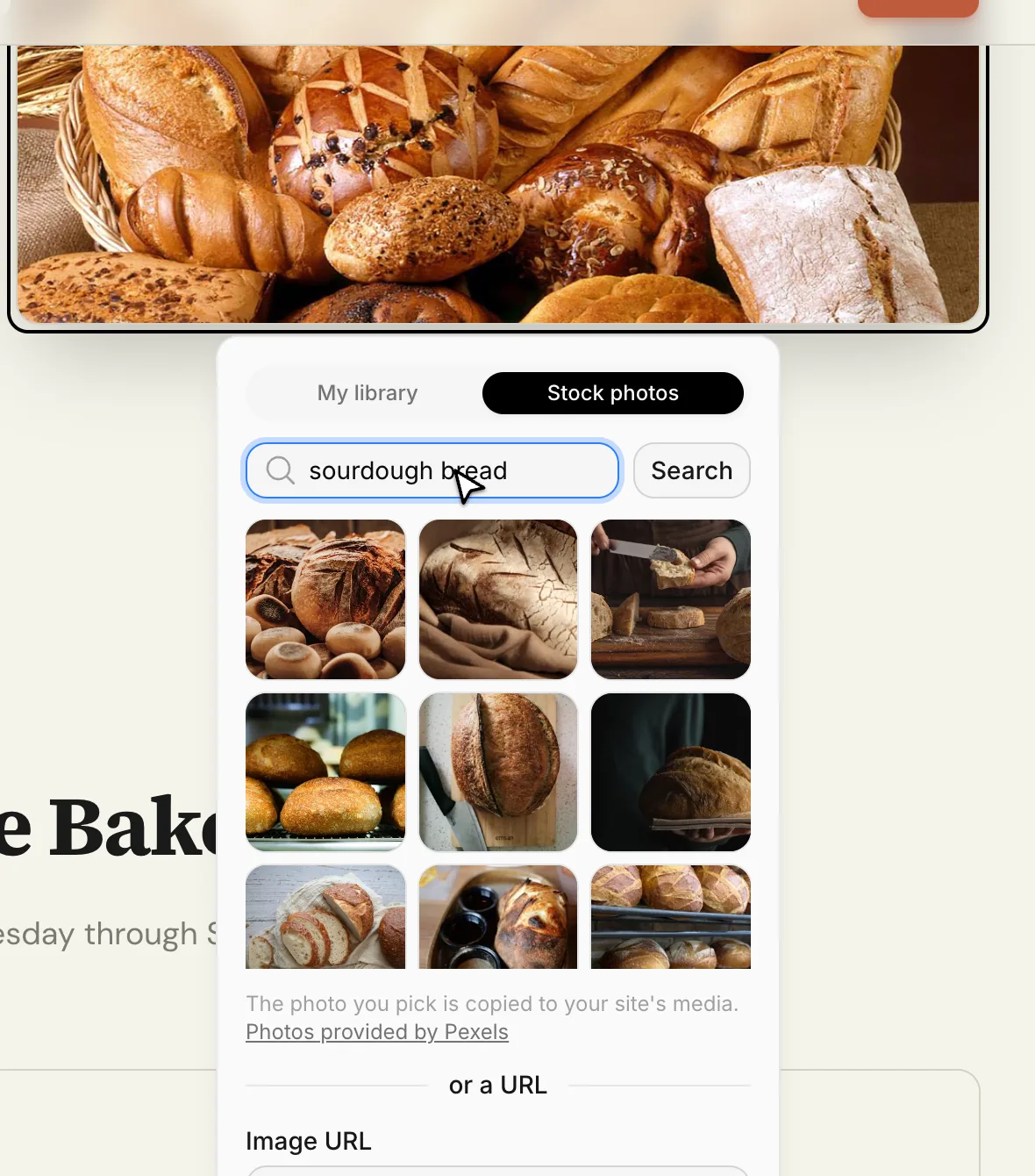
The photo you pick is copied to your site's media, so it stays on your site even if it's later removed from the source. The photos come from Pexels and are free for commercial use.
Link buttons
Buttons have a small link button next to them. Press it to choose where the button goes:
- Page: A page or collection entry on your site. The link keeps working even if you change the page's address later.
- Section: A specific block on a page; for example, linking a "Contact us" button to the contact form. When the visitor presses the button, the page scrolls to that block.
- Address: Another site (
https://…), a phone number or an email address.
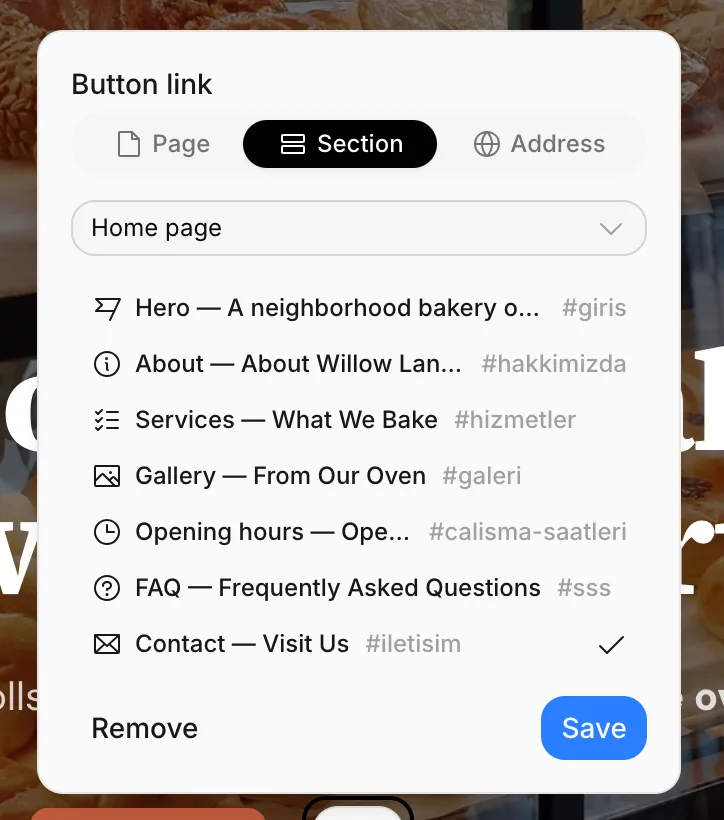
After choosing, press Save. Remove removes the link.
A link inside a text is added with Link in the formatting toolbar instead; there you type the address yourself (https://…, /about, tel:… and so on).
Cards, questions and photos
In list content such as service cards, FAQ questions, team members and gallery photos, a small toolbar appears when you hover over an item:
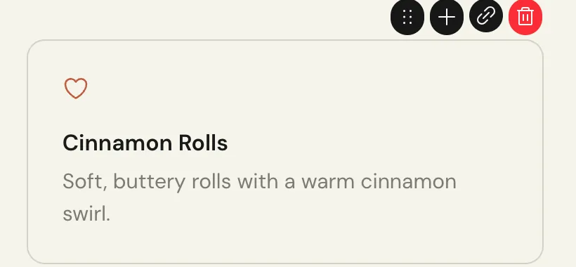
- Move (the dotted handle): Drag the item to change its position. With the handle focused, the arrow keys move it too.
- Add (+): Adds a new item right after this one.
- Link: Links the whole card to a page (see below).
- Delete: Removes the item.
To add a new item at the end of the list, press Add item below it, then type over the placeholders.
Each list has a minimum and maximum number of items; at the limit, the add or delete button doesn't appear.
Add several photos to a gallery
The Gallery block has an Upload photos button next to Add item. You can pick several photos at once; each uploaded photo is added to the gallery in turn.
Link a card to a page
In the Services, Process steps, Team, Numbers and Price list blocks, you can link a card to a page. The whole linked card becomes clickable, with a small arrow next to its title. For example, to link each service card to the page about that service, press the link button in the card's toolbar and choose the page. Linked cards show their link button in the primary color.
The easiest way to create separate pages for your services, products or projects is collections. See Collections.
Change icons
Clicking an icon, like the ones on service cards, opens the icon picker. Just press an icon. The icons' line style comes from your theme; when you change the theme, the icons follow the new style.